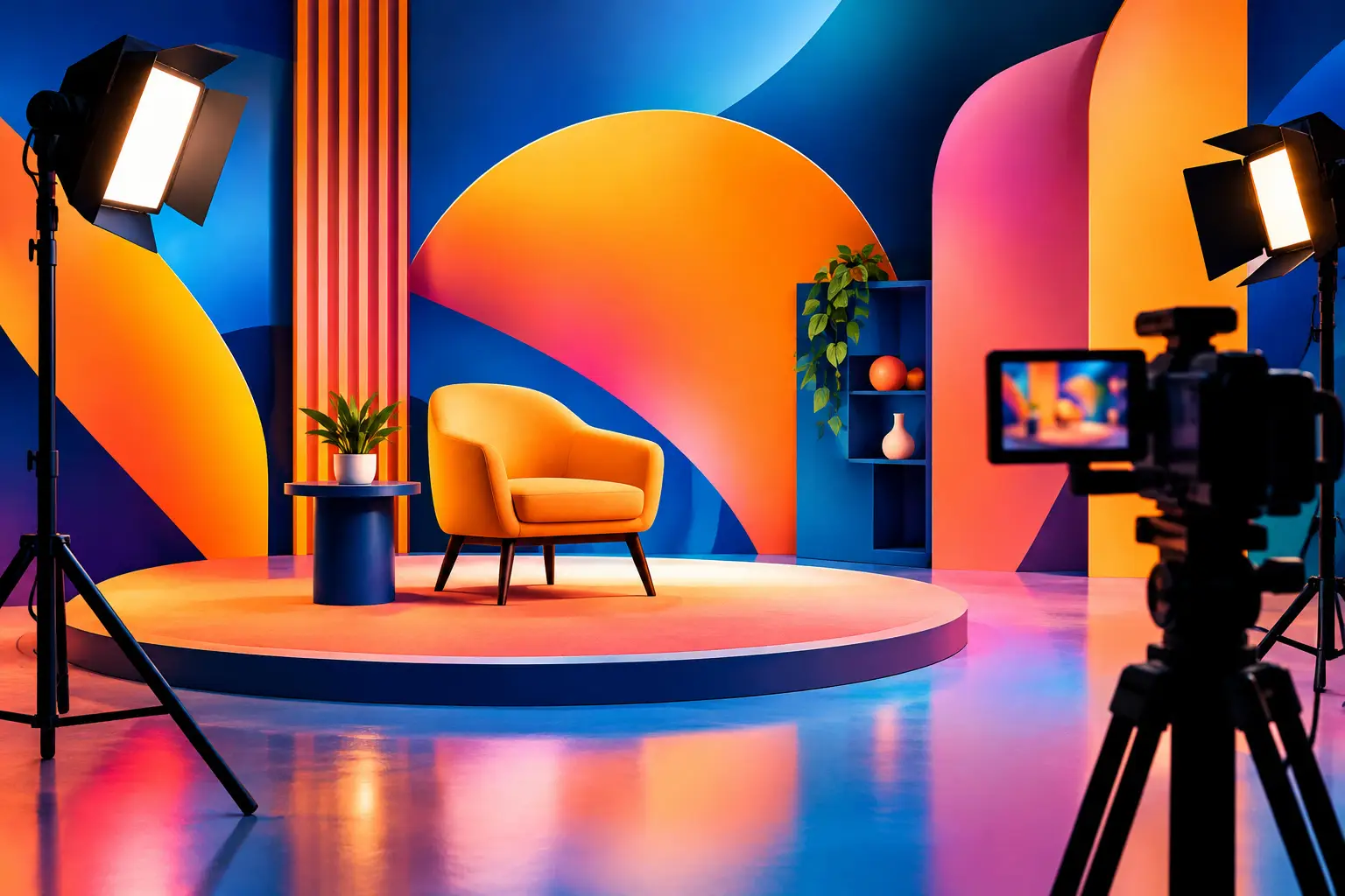
A branded set can look considered to the eye and still fall flat on camera. The difference is usually not budget. It is whether every surface, prop, colour and pool of light has been chosen for the frame. Knowing how to stage branded sets means building a space that carries a brand world without distracting from the product, person or message it is there to support.
A good set gives the camera options. It works in a wide campaign image, a vertical social clip and the tighter details required for cutdowns. It also gives the talent and crew a clear place to work, rather than turning the shoot into a day of moving objects between takes.
Start with the frame, not the room
The most common staging mistake is treating a set like a display. A styled table, shelf or corner may look right when viewed in person, but production only sees what makes it into shot. Begin with the intended crops, lensing and camera height. Decide where the hero action happens, what will sit behind it and how much negative space the art direction needs.
For a skincare campaign, that may mean holding a clean area around the product for supers and paid social copy. For a food brand, it might mean allowing room for hands, steam, pouring action and the occasional imperfect spill. The set should be designed around those requirements before decorative pieces are added.
Ask the director, photographer or content lead to identify the essential frames early. A simple shot plan changes the build immediately. If you need profile, straight-on and overhead imagery, the hero surface needs to hold up from all three angles. A backdrop that only works front-on will quickly become a limitation.
Build a visual system, not a prop pile
Branding does not need to appear as a logo printed across every object. In fact, direct branding is often more effective when used sparingly. The stronger route is to translate the brand into a repeatable visual system: a distinct palette, material language, level of polish and type of object.
A premium drinks brand might use smoked glass, brushed metal and low, directional light. A playful snack launch may call for saturated colour blocking, soft curves and bolder scale. A considered wellness brand could sit more naturally with chalky finishes, timber, linen and restrained tonal contrast. The decisions should feel connected, even when the final images feature several set zones.
Choose one hero material and one or two supporting textures. Too many finishes compete on camera, particularly in a small frame. Matte materials generally give more control than glossy ones, while reflective surfaces can be useful where the brief needs energy, depth or a deliberate highlight. It depends on the product too. A glossy pack against a glossy table can create difficult reflections; a matte base may let the packaging do the work.
Colour needs the same discipline. Establish a core colour, a support tone and a neutral. This prevents the set becoming visually noisy while still giving the team enough variation for multiple assets. Test colours beside the product before committing. Packaging that reads bright white under one light can take on unwanted blue, green or cream tones against its surroundings.
How to stage branded sets around a hero product
The product should have a clear job in every shot. Is it the object being admired, used, unboxed, poured, worn or passed between people? Staging follows that action.
Give the hero product physical and visual separation. It may need a plinth, a tray, a contrasting surface or simply a cleaner patch of background around it. This is not about making the product look isolated. It is about ensuring a viewer can read it in a second, even on a phone screen.
Scale matters here. Props that are too small can look fussy, while oversized pieces can make a product feel insignificant. Build depth with foreground and background elements, but keep the immediate area around the product controlled. A foreground blur from a glass, plant or prop can add a sense of place. It should not obscure the pack, label or key detail.
Make room for the real-world production needs as well. Products may need replacing between takes. Food may need refreshing. Clothing needs steaming, accessories need matching, and beauty products may need a clean duplicate for close-ups. A well-staged set includes a nearby reset area so that the hero frame stays intact while the crew works.
Choose light before finalising the build
A set is never finished until it has been lit. Material, colour and texture can change dramatically once a key light is in position. Before dressing every corner, test the main lighting direction and look for unwanted shadows, hot spots and reflections.
A controlled blackout environment suits sets where consistency matters most. You can shape a hard shaft of light across a pack shot, create a clean high-key product scene or hold the same look from morning through to late afternoon. This makes it easier to build a set around precision rather than adapting to changing conditions.
A daylight-led space can bring a different value: natural fall-off, softer movement and a lived-in quality that works well for editorial, lifestyle and social-first content. But daylight asks for flexibility. Cloud cover, time of day and window direction will affect the set, so plan the critical shots around the most reliable part of the day and have diffusion or artificial support available.
Practical lights can add depth, especially for evening scenes, hospitality concepts or home interiors. Treat them as part of the composition rather than background decoration. Check their colour temperature and brightness on camera. A warm lamp can look inviting, but if it blows out or clashes with the key light, it becomes a problem rather than an atmosphere.
Make the set useful from more than one angle
Campaign production rarely needs one perfect image. Brands need portrait crops, landscape edits, motion, behind-the-scenes material and enough variation to keep a rollout from feeling repetitive. Design the set in zones so it can shift without being rebuilt from scratch.
One side might hold the clean hero setup, another a textured lifestyle moment, and a third a detail area for hands, ingredients or product interaction. Keep the visual language consistent across each zone, but vary the framing, surface and prop arrangement. This gives editors meaningful options rather than near-identical takes.
Avoid locking every object in place too early. Photograph or mark the approved hero arrangement, then allow the stylist and creative team to make controlled changes. Moving a chair, reversing a table, stripping back a shelf or changing a background colour can produce a second set of assets with very little additional build time.
This is particularly useful for content shoots with a short turnaround. Instead of trying to dress five completely separate sets, build one adaptable environment with components that can be reconfigured. The result is usually more coherent, faster to shoot and kinder to the budget.
Plan for movement, crew and resets
A set that looks right but leaves no route for camera, lighting or talent will slow the day down. Leave space behind camera, allow access to power and avoid placing fragile styling where crew need to stand. If the shoot involves movement, rehearse it before the final dress. Hands reaching for a product, a model entering frame or a camera move can expose gaps that a static test image will miss.
Consider what happens outside the crop too. Spare props, packaging, cleaning materials and styling tools should have a designated holding area. This keeps the working environment calm and makes continuity easier to maintain. For larger crews, assign responsibility for resets. It saves time and protects the approved look across multiple takes.
At Lit Studios, choosing between a blackout corner and a daylight space can be the first production decision, not an afterthought. Match the environment to the visual requirement, then stage for the frames the campaign genuinely needs.
The best branded sets feel specific without feeling over-explained. When the product, lighting and styling are all pointing in the same direction, the audience reads the brand before they have time to analyse why.
Leave a Reply